Overview
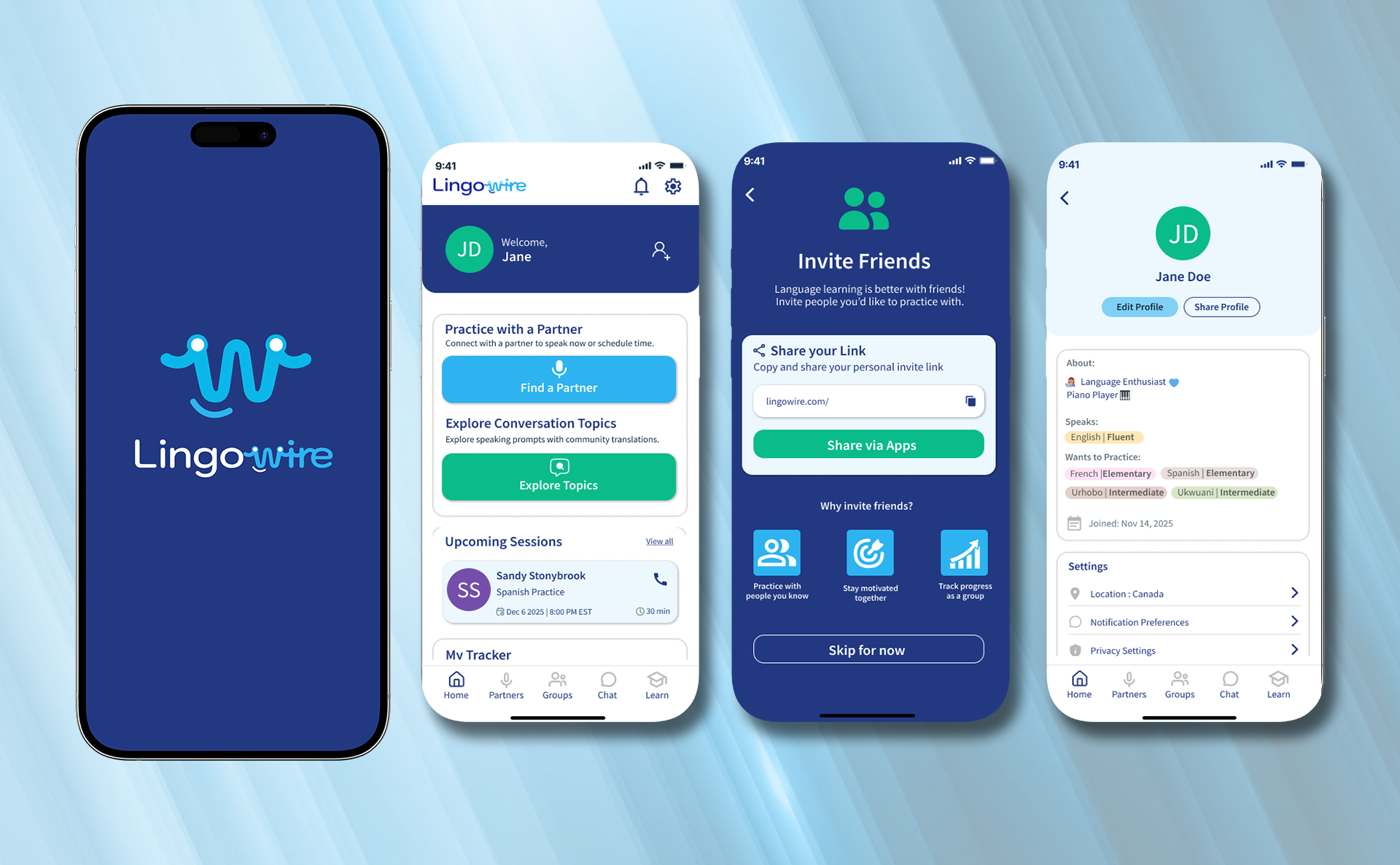
I had the opportunity to work on developing Lingowire's logo and brand identity, along with designing the mobile app interface and a web landing page. My design focused on translating Lingowire's mission, which included building a community alongside practicing language, into an intuitive and user centric app design. After various design iterations and user testing, the app was successfully launched on Google Play and the App store, available to the public for downloading.
I had the opportunity to work on developing Lingowire's logo and brand identity, along with designing the mobile app interface and a web landing page. My design focused on translating Lingowire's mission, which included building a community alongside practicing language, into an intuitive and user centric app design. After various design iterations and user testing, the app was successfully launched on Google Play and the App store, available to the public for downloading.

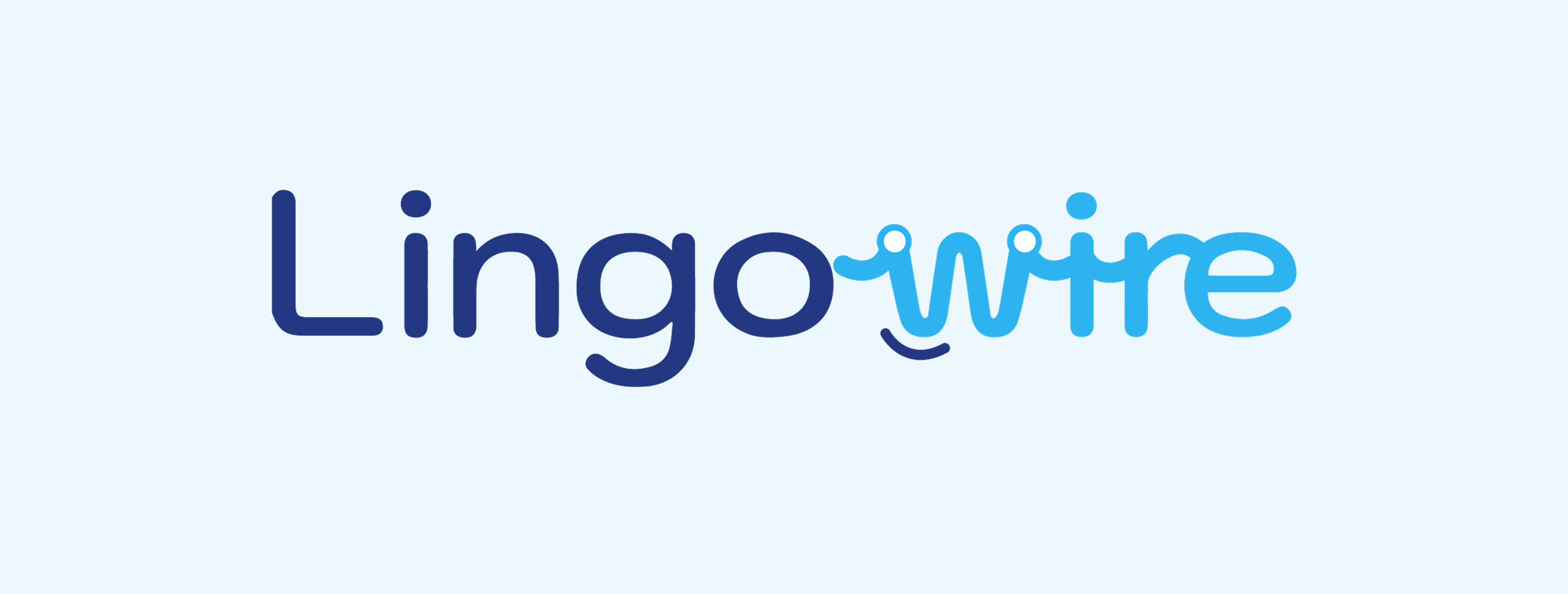
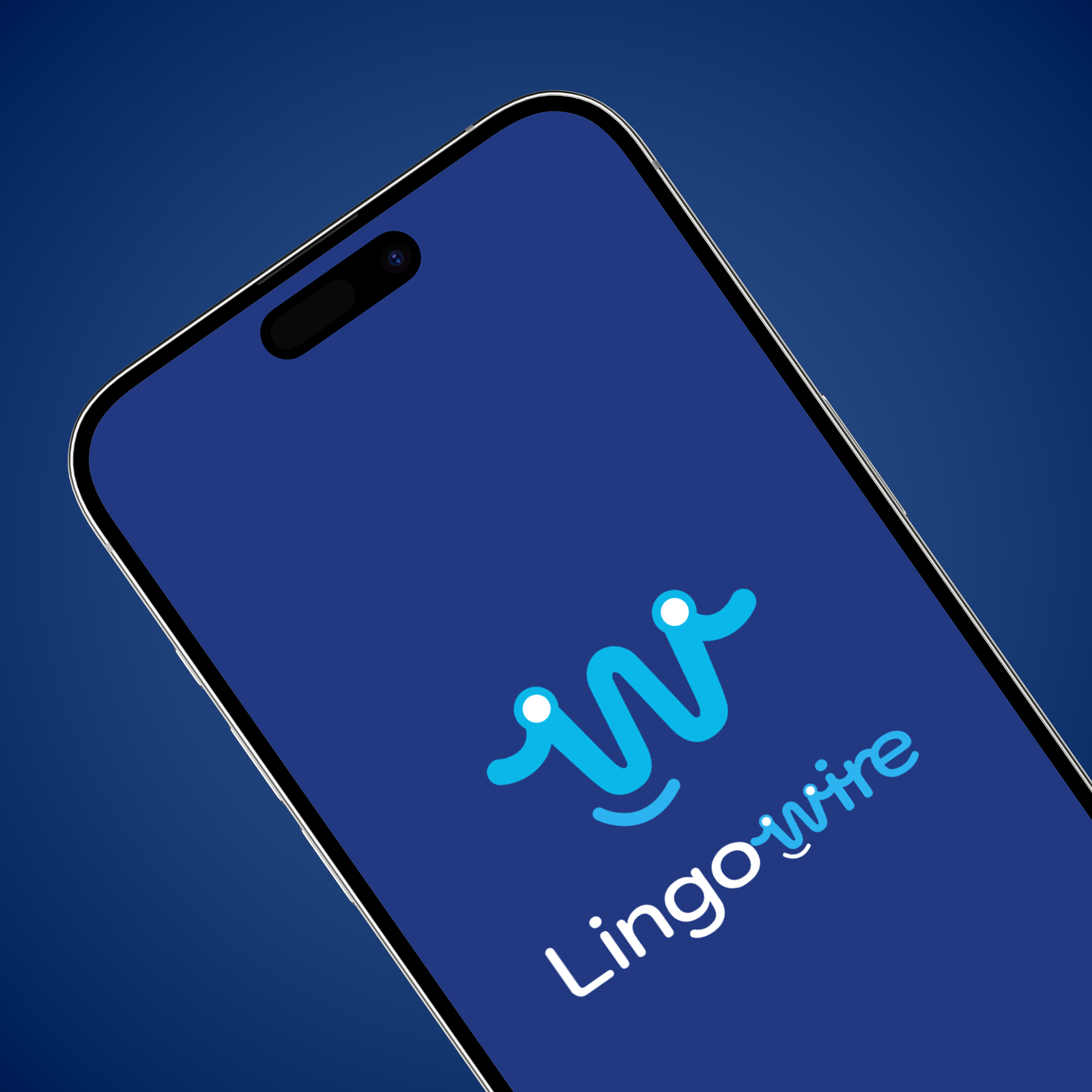
Lingowire main logo
Logo Design
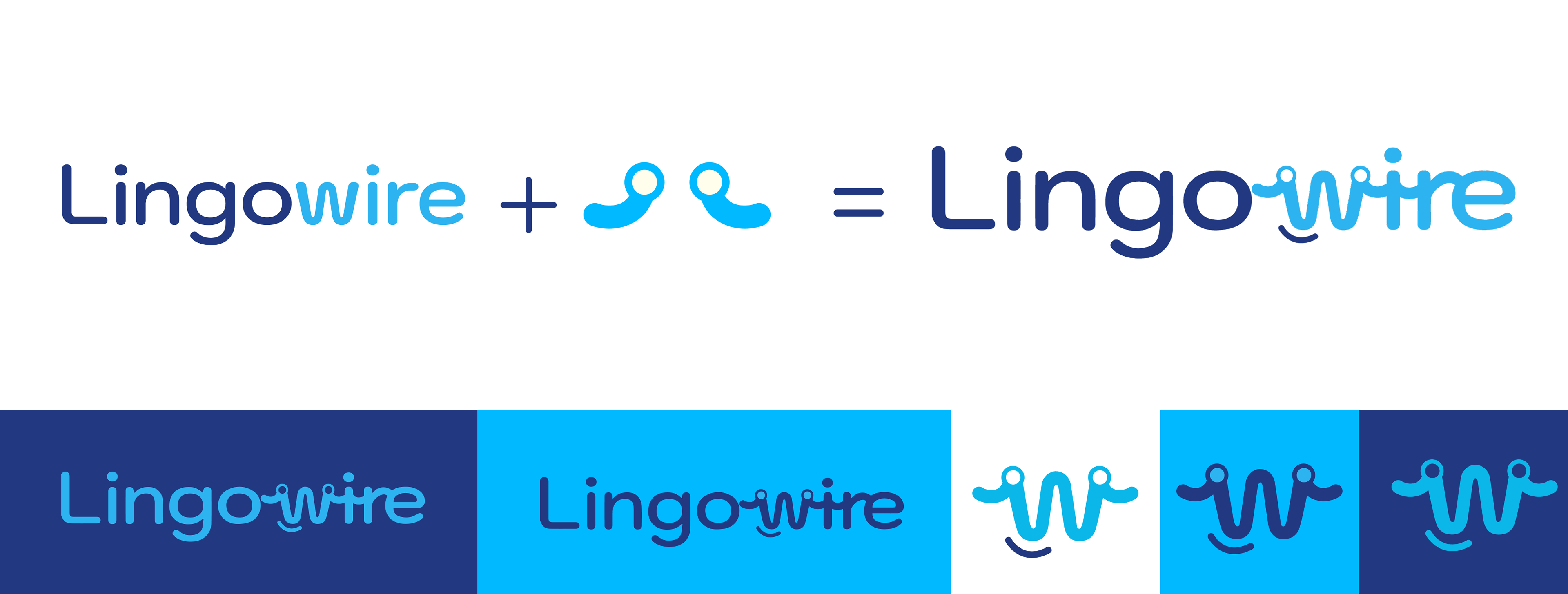
The concept for Lingowire's logo was to make it feel approachable and friendly to its audience and translate the idea that Lingowire is not only a place for learning, but also a platform for building connections and a language community. The "W" in Lingowire not only is a part of the wordmark, but also serves as the company's mascot, setting in apart from traditional detailed mascots.
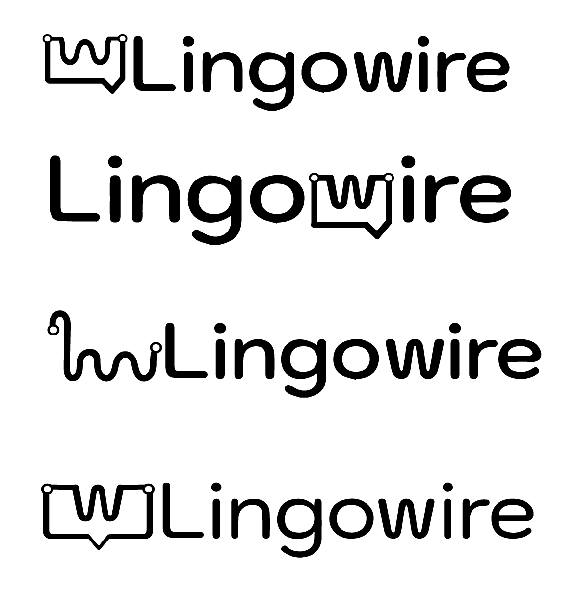
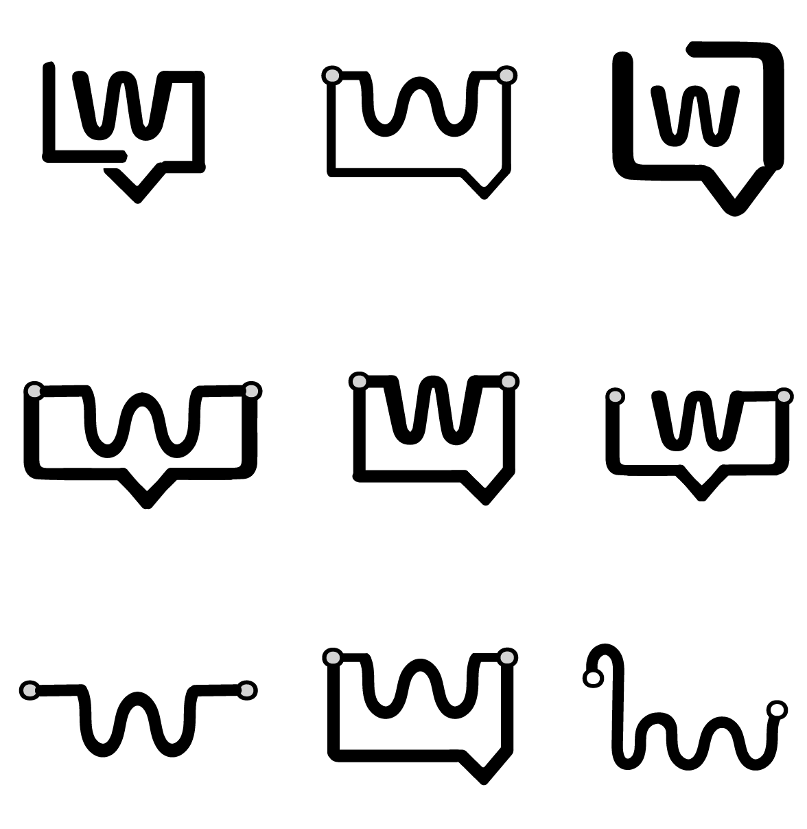
I experimented with different icons that represented language and speaking. The client was keen on the idea of having a mascot incorporated in the logo but since it was something a handful of competitors had also included in their branding as well, I decided to take a different route and see if there was a way I could integrate a symbol that would also work as a mascot.
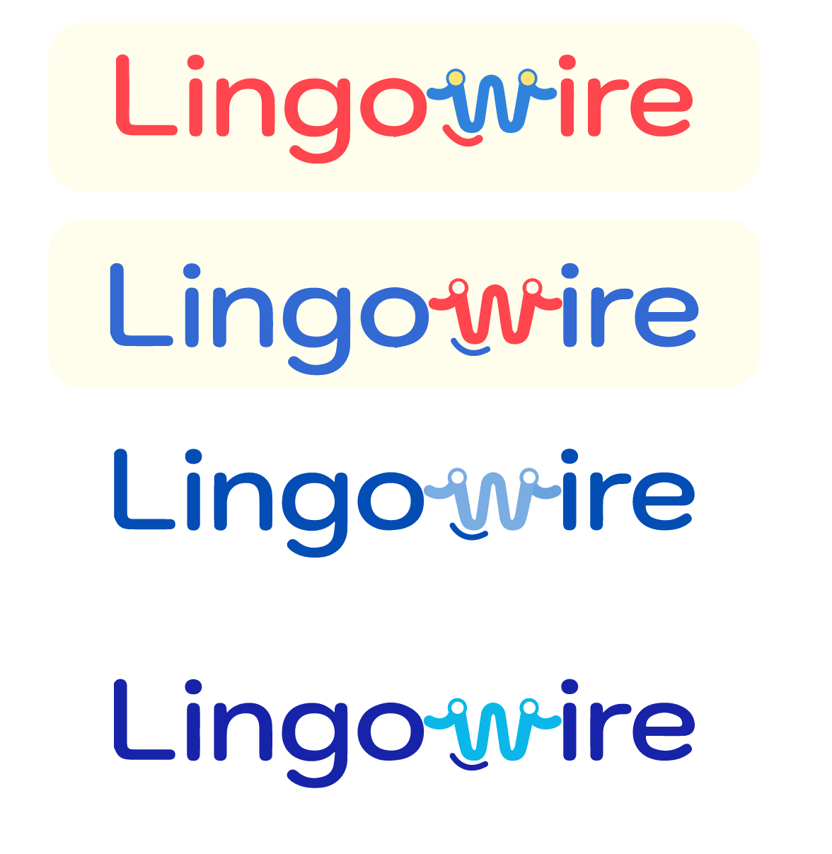
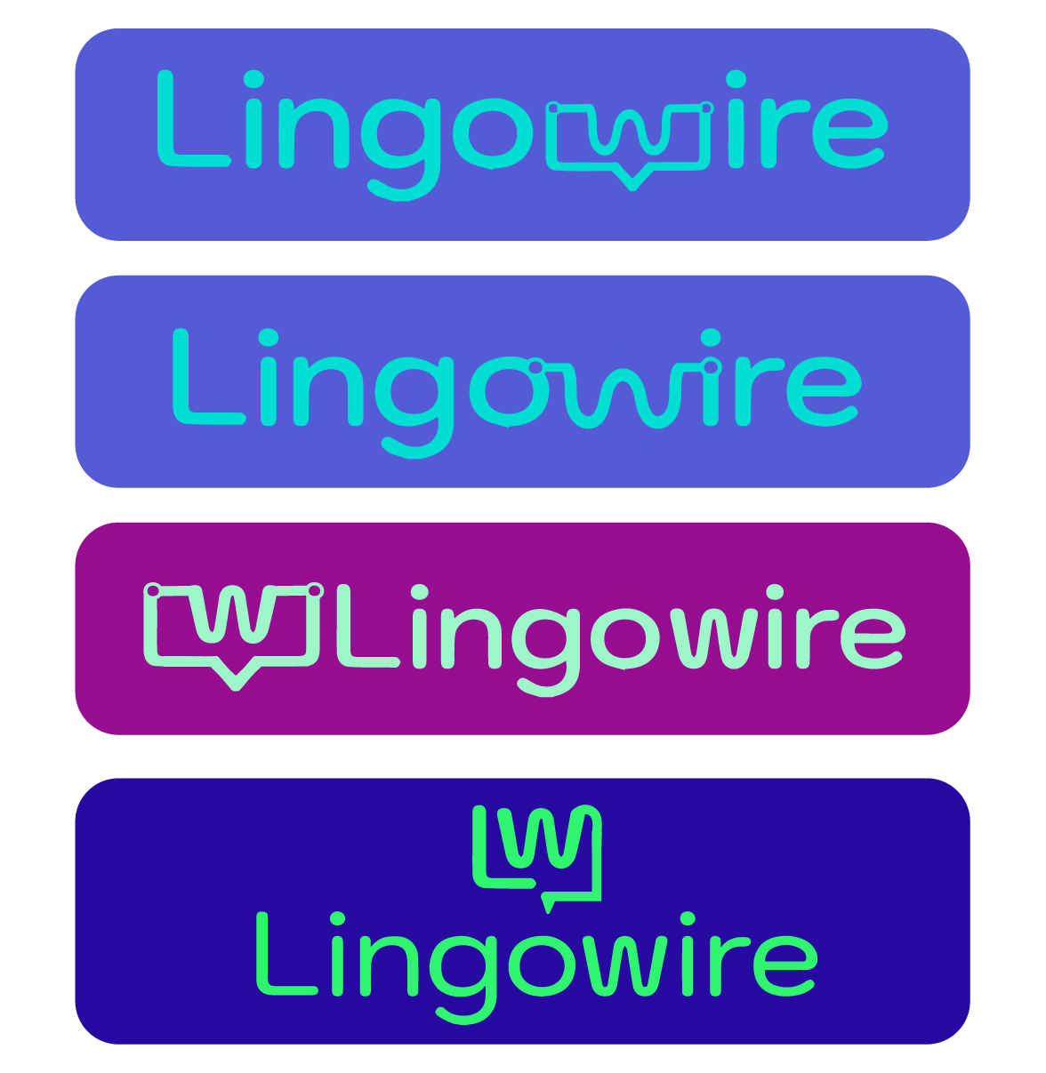
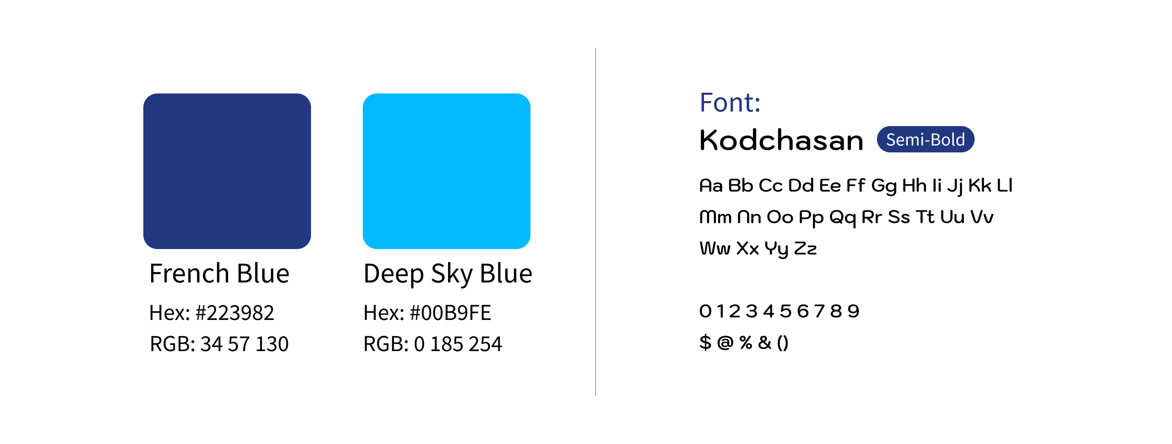
After dappling with some colour combinations, the client was leaning towards primary colours to represent foundation but then after some logo trials, we came upon shades of blue, conveying trust and value. At this point, I decided that I needed to tweak the symbol in a way that it wouldn't overpower the text heavy wordmark. It dawned on me that since Lingowire is a platform based on connection, why not combine that in the logo. As a result, the logo was successfully conceptualized, delivering a perfect balance between the symbol and the wordmark.


Lingowire App Design
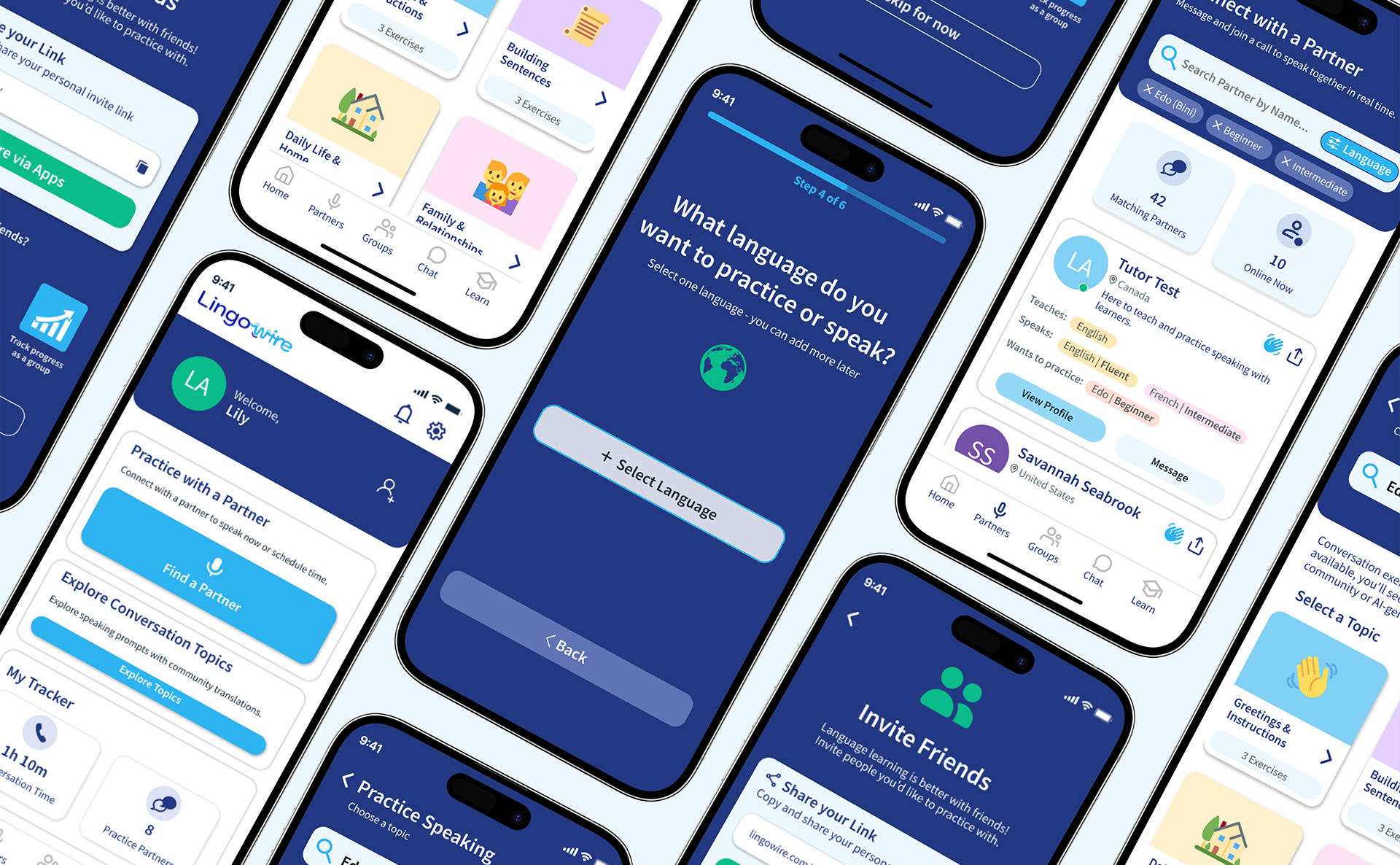
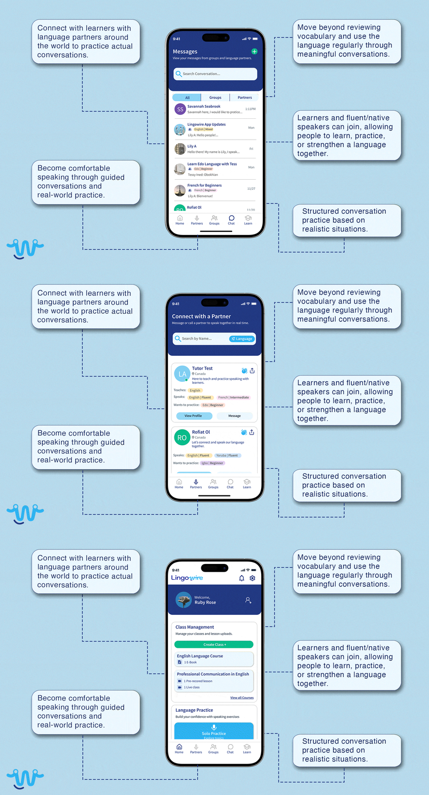
The features of the app were designed in a way that would allow users to attain maximum benefit and ease of navigation. The idea was that instead of providing users with words and phrases in different languages alognside their meanings, Lingowire provided their users with the opportunity to practice and speak their chosen language using self guided learning or with partners and groups.
The features of the app were designed in a way that would allow users to attain maximum benefit and ease of navigation. The idea was that instead of providing users with words and phrases in different languages alognside their meanings, Lingowire provided their users with the opportunity to practice and speak their chosen language using self guided learning or with partners and groups.

Style Guide
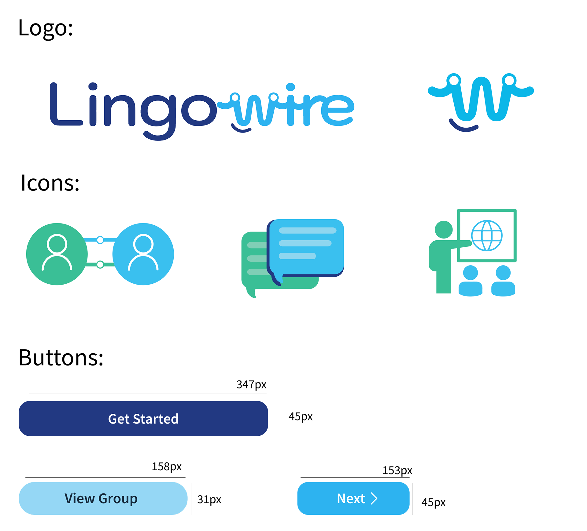
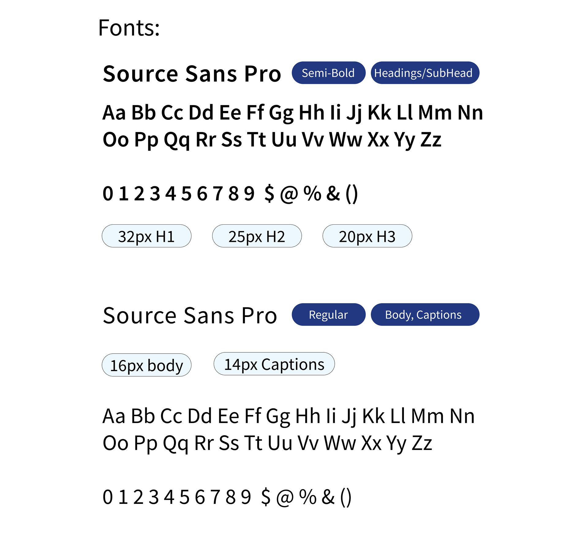
The Lingowire App Interface will extend the colours of the logo with an additional accent colour for icons. The main sections of the app include the onboarding, features, and different ways to connect with users. The style guide shows the iconography to be used in the app and the fonts. An accessible font, Source Sans Pro was chosen which will be used for headings and body.


Lingowire app features

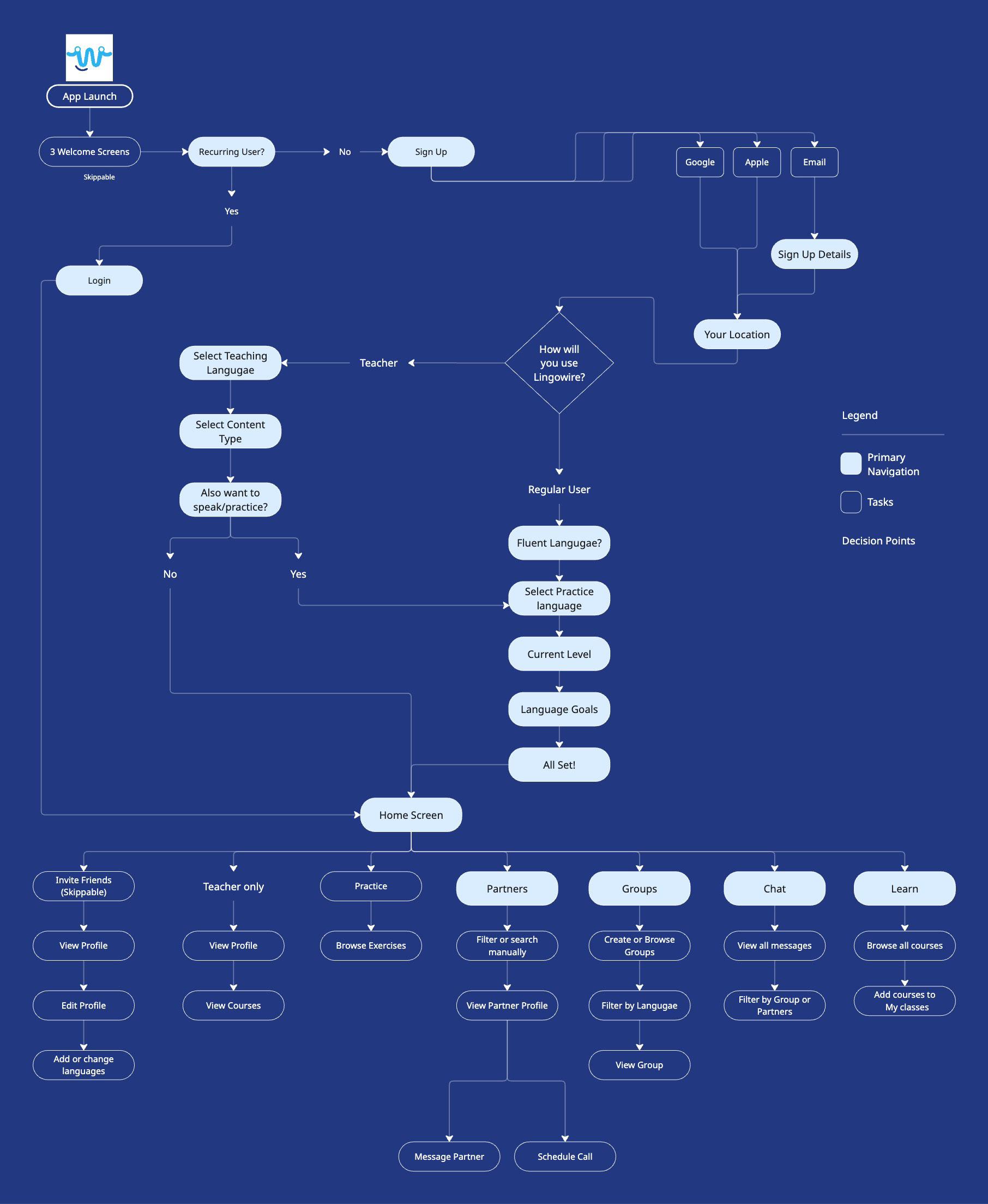
Lingowire app user flow
Lingowire UI Design
The app was run through beta testing in which about 30 users from different backgrounds and professions were asked to use the app. The feedback was overall very positive, with users pointing out that the experience of navigating through this app was fairly easy and intuitive. The app was successfully launched on Google Play and Apple Store, available for download.
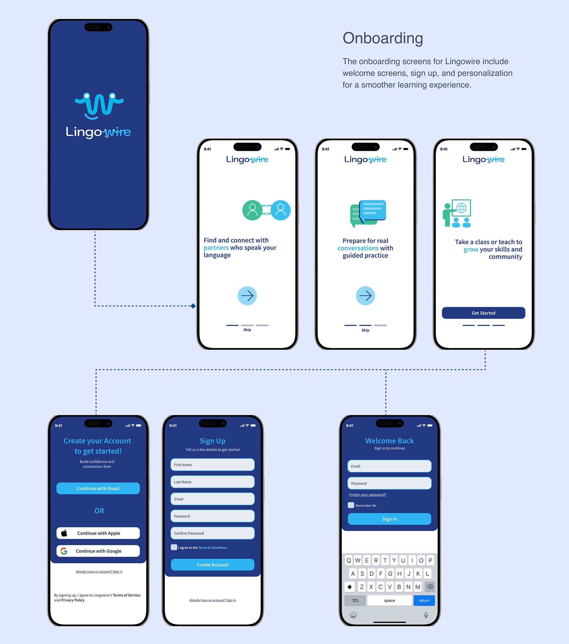
Lingowire App interface desgin, Onboarding
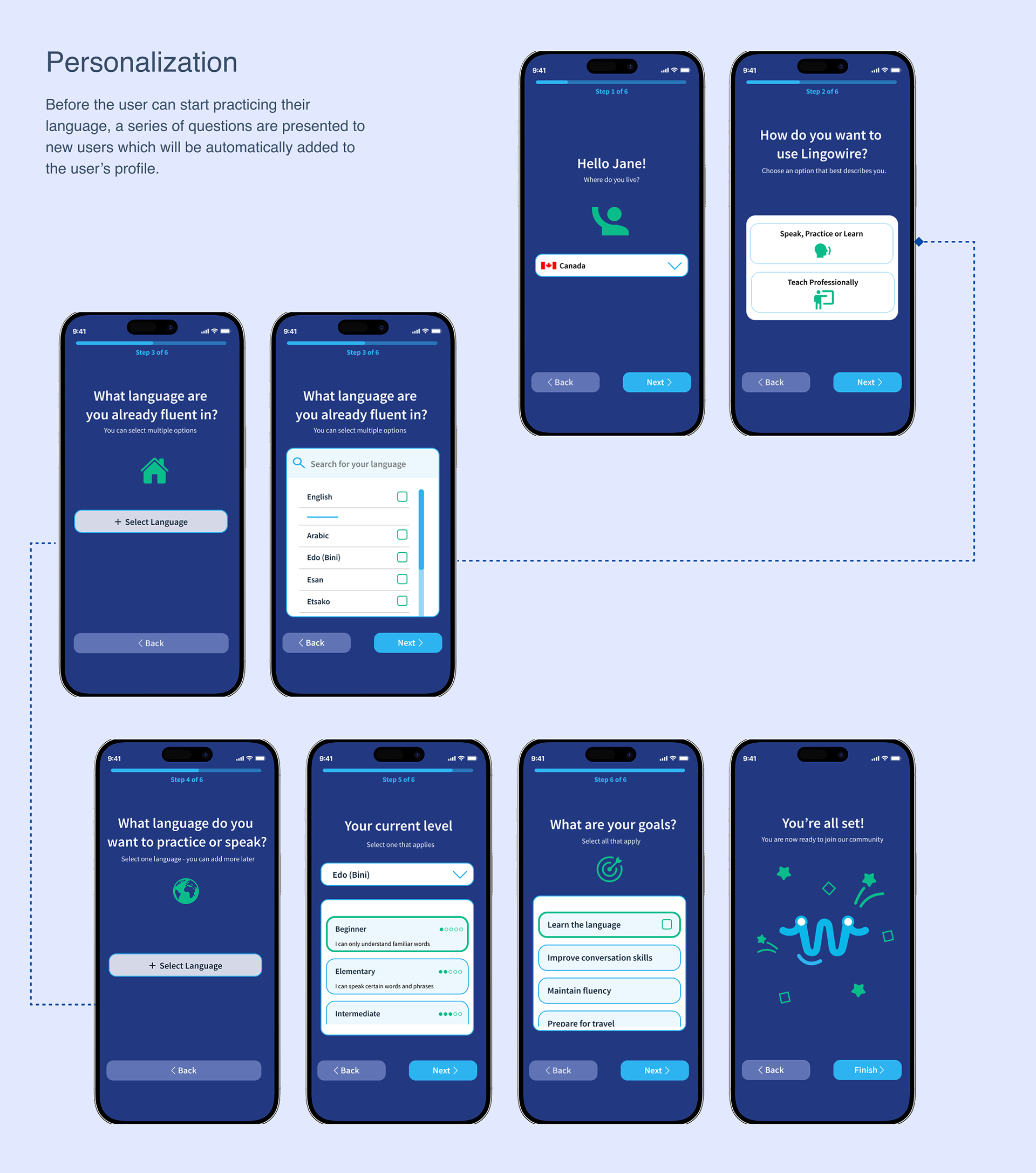
Lingowire App interface desgin, Personalization
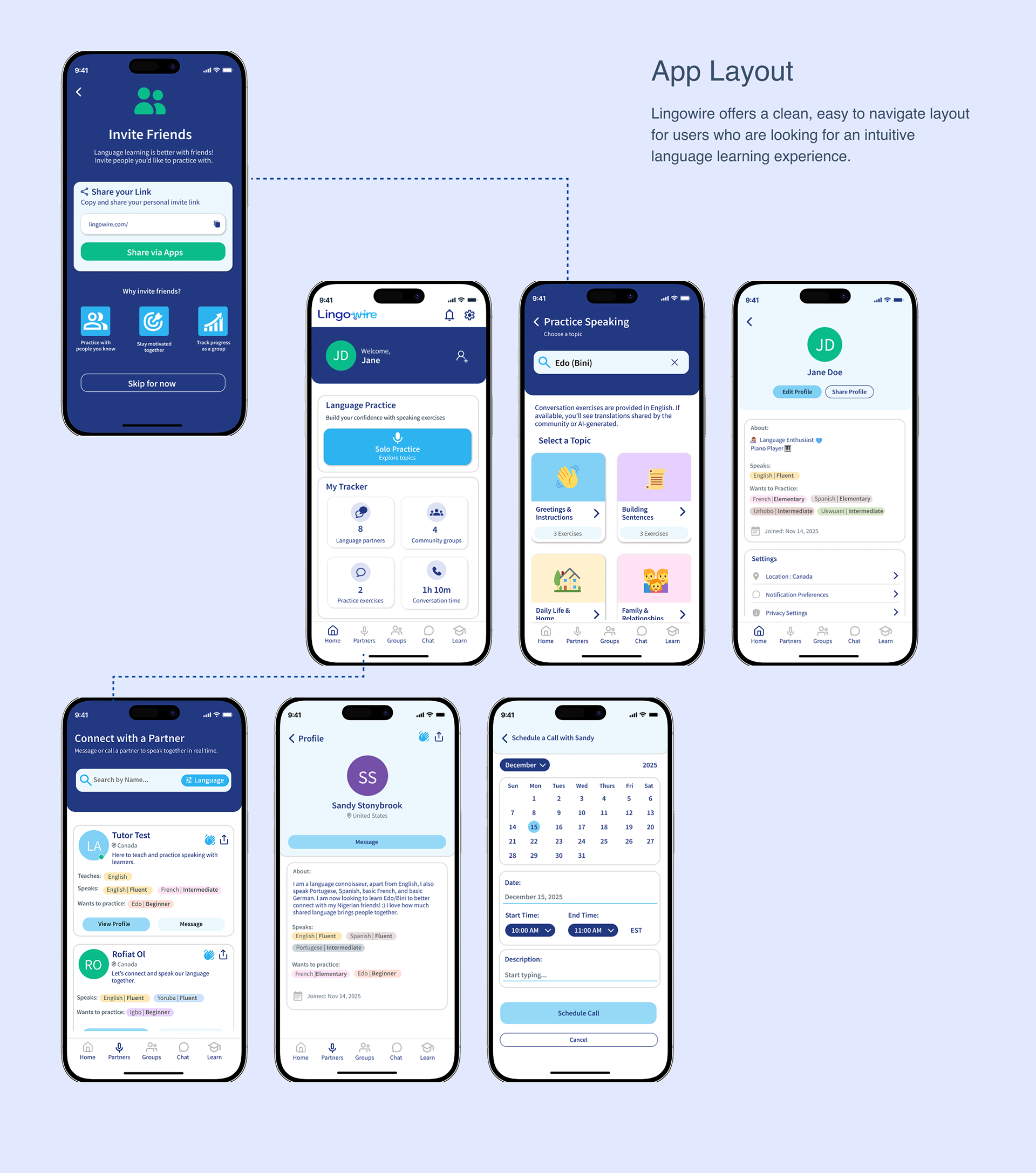
Lingowire App interface desgin, main features
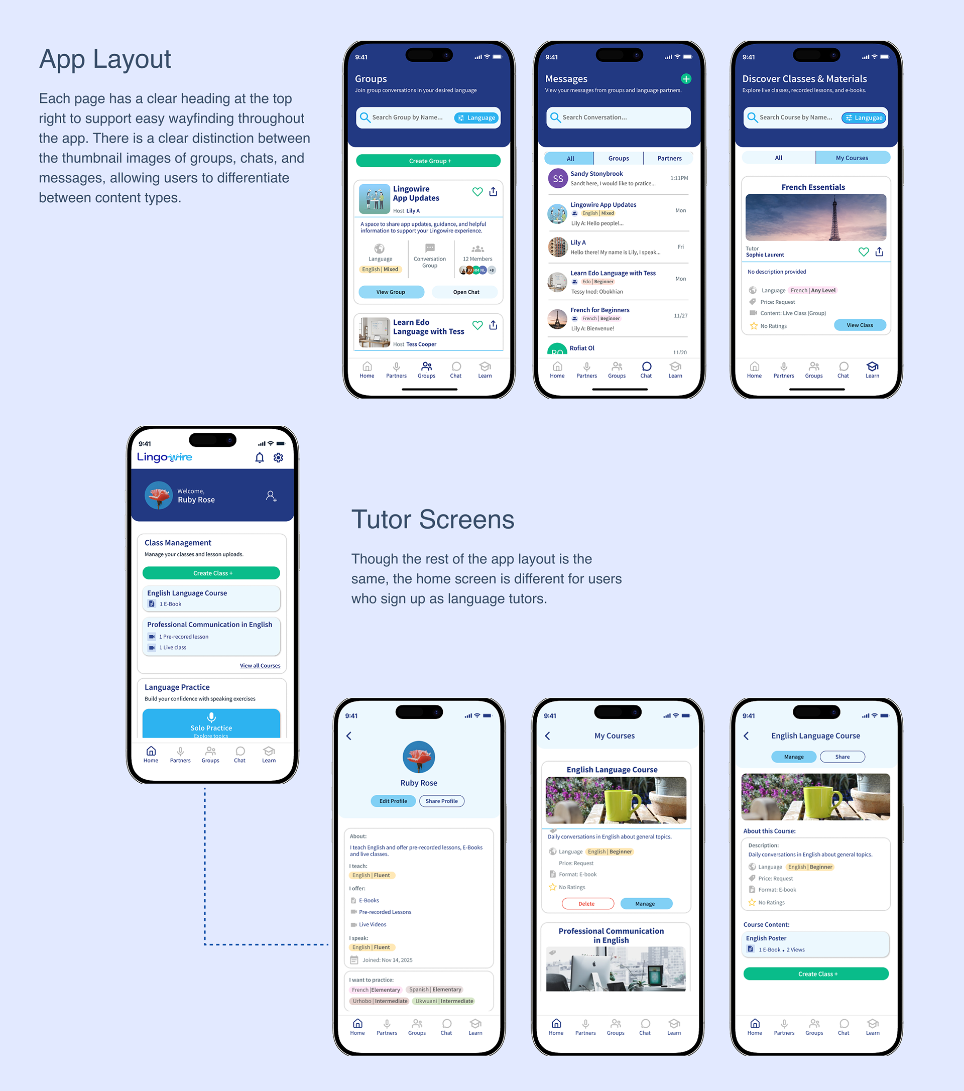
Lingowire App interface desgin, Groups and Tutor Screens
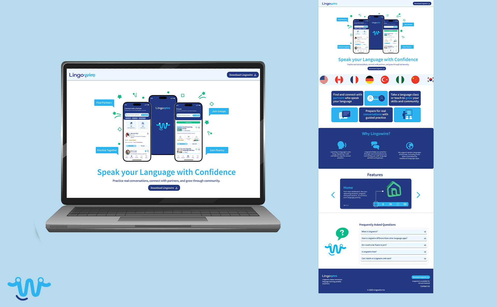
Lingowire web landing page design
Lingowire Landing Page
The landing page for Lingowire served as an introduction to the app, prompting users to download the app. The web page included four main sections, the hero section where two CTA buttons are placed strategically for download. The image of the app also showcases its key features. The second section talks about Lingowire's mission, which is similar to that of the onboarding screen of the app. The third sections includes a breakdown of features existing within the app and the fourth is a FAQ segment.
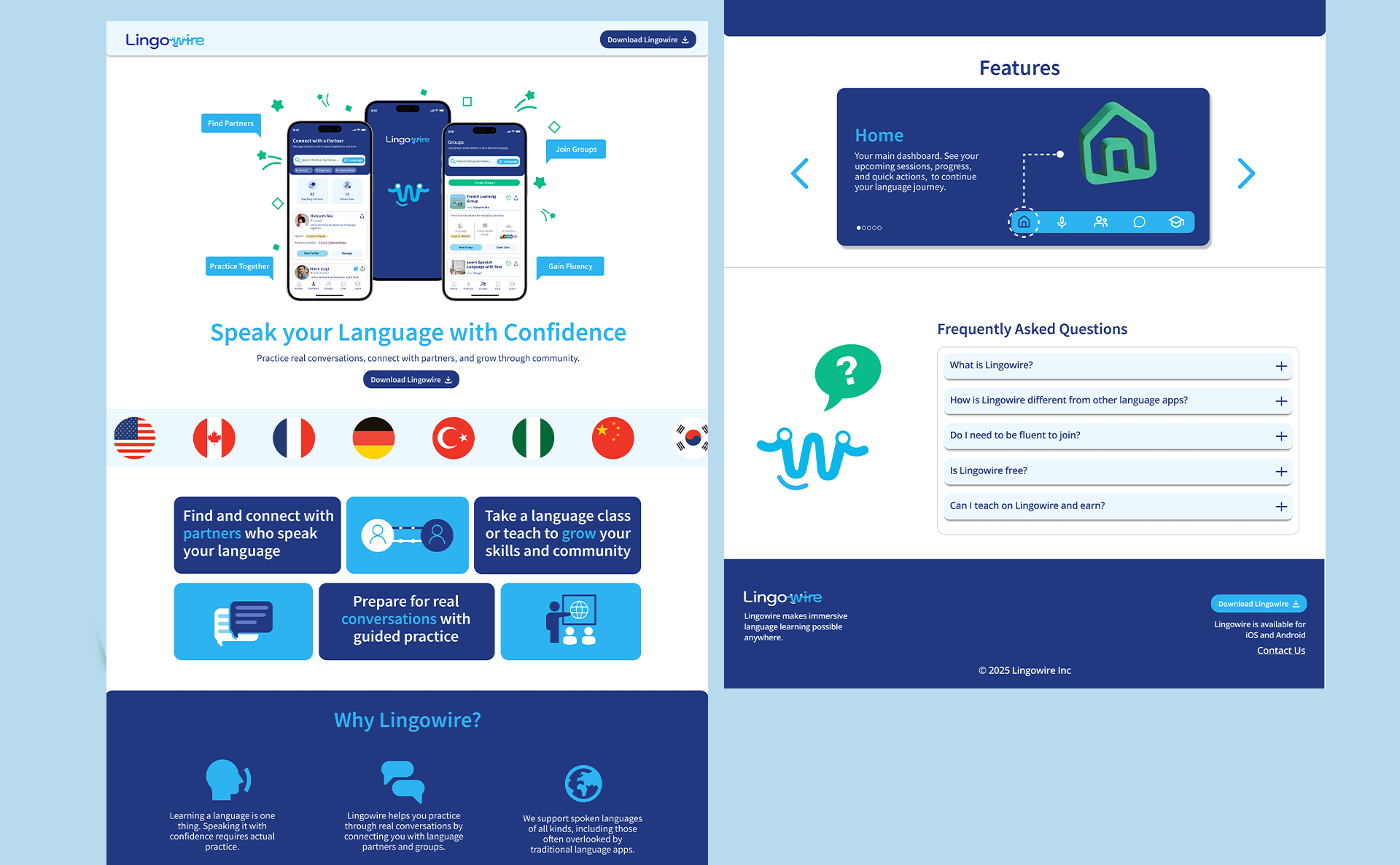
Lingowire landing page